Ansel Adams (1902-1964), photographer of the majestic, was exceptionally elusive when it came to why he preferred black-and-white photographs over color, offering only a few comments on his medium of choice. He believed that black-and-white photography was a “departure from reality” which is true on many levels but that is also true of most artistic efforts and products. He also held the elementary belief that “one sees differently with color photography than black-and-white.” Some have even suggested that Adams said, “…when you photograph them in black and white, you photograph their souls,” but this seems apocryphal since most of his oeuvre was landscape photography.
Adams’s black-and-white photography framed the grandeur of the mountainous West in stark, unembellished terms. Yet without color, a coolness loiters, untouched by human sentiment or warmth. As an unabashed environmentalist, maybe that was his point, the majesty of the outdoors was diminished by human presence. In black-and-white, the wilderness remained unsullied and alone.
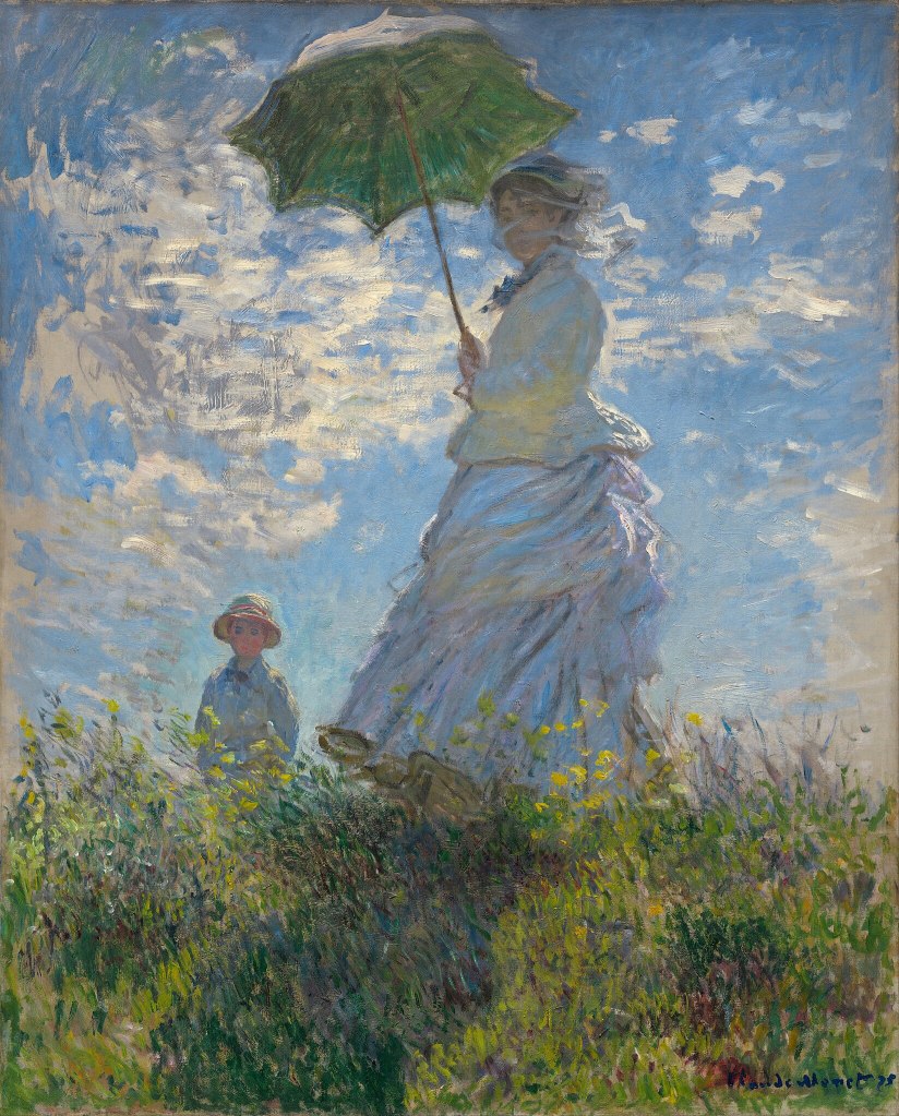
But to Claude Monet (1840-1926), founding French Impressionist, color and light, was everything in his eye. Color defined his paintings, professing that “Color is my day-long obsession, (my) joy…,” he confessed. Color was also a constant burden that he carried with him throughout the day and into the night, lamenting, “Colors pursue me like a constant worry. They even worry me in my sleep.” He lived his aphorism: “Paint what you really see, not what you think you ought to see…but the object enveloped in sunlight and atmosphere, with the blue dome of Heaven reflected in the shadows.” His reality was light and color with a human warming touch.
Adams and Monet’s genius were partially contained in their ability to use light to capture the essence of the landscape, but Monet brought the soul along in living color. Monet’s creed, “I want the unobtainable. Other artists paint a bridge, a house, a boat, and that’s the end…. I want to paint the air which surrounds the bridge, the house, the boat, the beauty of the air in which these objects are located…”
Color is a defining quality of humanity. Without color life would be as impersonal as Adam’s landscapes, beautiful, majestic even, but without passion or pulse. A sharp, stark visual with little nuance, no emotional gradations from torment to ecstasy, just shadows and form.
Understanding color was not just a technical revelation for 19th-century French artists, it was a revolutionary awakening, a new approach to how the eye viewed color and light. The Impressionists and Pointillists brought a new perception to their canvases. And the catalyst for this leap away from the tired styles of Academic Art and Realism was Michel Eugene Chevreul, a chemist whose insight into color harmony and contrast inspired the Monets and Seurats to pursue something radically different in the world of art. His chromatic studies inspired them to paint not for the viewer’s eye, but with it, transforming perception from passive witness into an active collaboration between painter, subject, and observer.
Chevreul’s breakthrough was deceivingly simple. Colors are not static blots on a canvas but relational objects that come alive when surrounded by other hues of the spectrum. A hue in isolation is perceived differently than when seen next to another. Red deepens next to green; blue pulsates with enthusiasm against orange. This principle, simultaneous contrast, revealed that the eye does not just passively accept what it sees but synthesizes it to a new reality.
Chevreul’s theories on complementary colors and optical mixing laid the foundation for painters to forsake rigid outlines, often rendered in the non-color of black, and embrace Impressionism: not merely an art style, but a promise of perception, a collaboration between painter and viewer. Rather than blending pigments on a palette, artists like Monet and Seurat placed discrete strokes side by side, allowing the viewer’s mind to complete the image.
This optical mixing is a product of the way the eye and the brain process the various wavelengths of white light. When complementary colors are adjacent to one another the brain amplifies the differences. Neurons in the eye are selfish. When a photoreceptor is stimulated by a color it suppresses adjacent receptors sharpening the boundaries and contrast. And the brain interprets what it sees based on context. Which is why sometimes we see what is not there or misinterpret what is there, such as faces on the surface of Mars or UFOs streaking through the sky. There is also a theory that the brain processes color in opposing pairs. When it sees red it suppresses green creating a vibrancy of complementary colors when placed together.
The Impressionists intensely debated Chevreul’s concepts then they brushed them to life with paint. They painted not concrete objects, but forms shaped by light and color. Haystacks and parasols within a changing mood of contrasting color. . Interpretation by the eye of the beholder.
Chevreul’s collected research, The Principles of Harmony and Contrast of Colors and Their Applications to the Arts, originally published in 1839, remains in print nearly two centuries later.
Source: The Principles of Harmony and Contrast of Colors and Their Applications to the Arts by Michel Eugène Chevreul, 1997 (English Translation). Graphic: Woman with a Parasol by Monet, 1875. National Gallery of Art, Washington, DC. Public Domain.